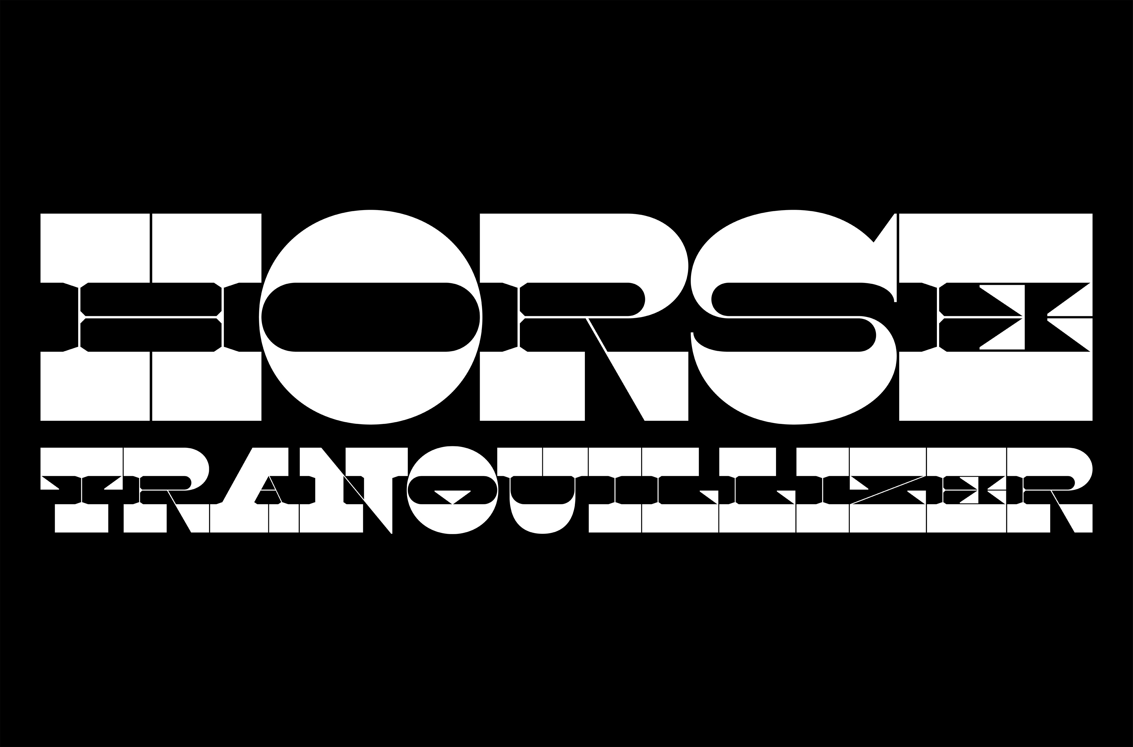
drawing weird letters

type design —

I look at type design as a hobby, something I explore in my own time at my own pace. I tend to lean towards modular letterform design systems to see how I can implement typographic DNA throughout a glyph set. Being able to use what I make in my design work is a bonus.

orca

project details —

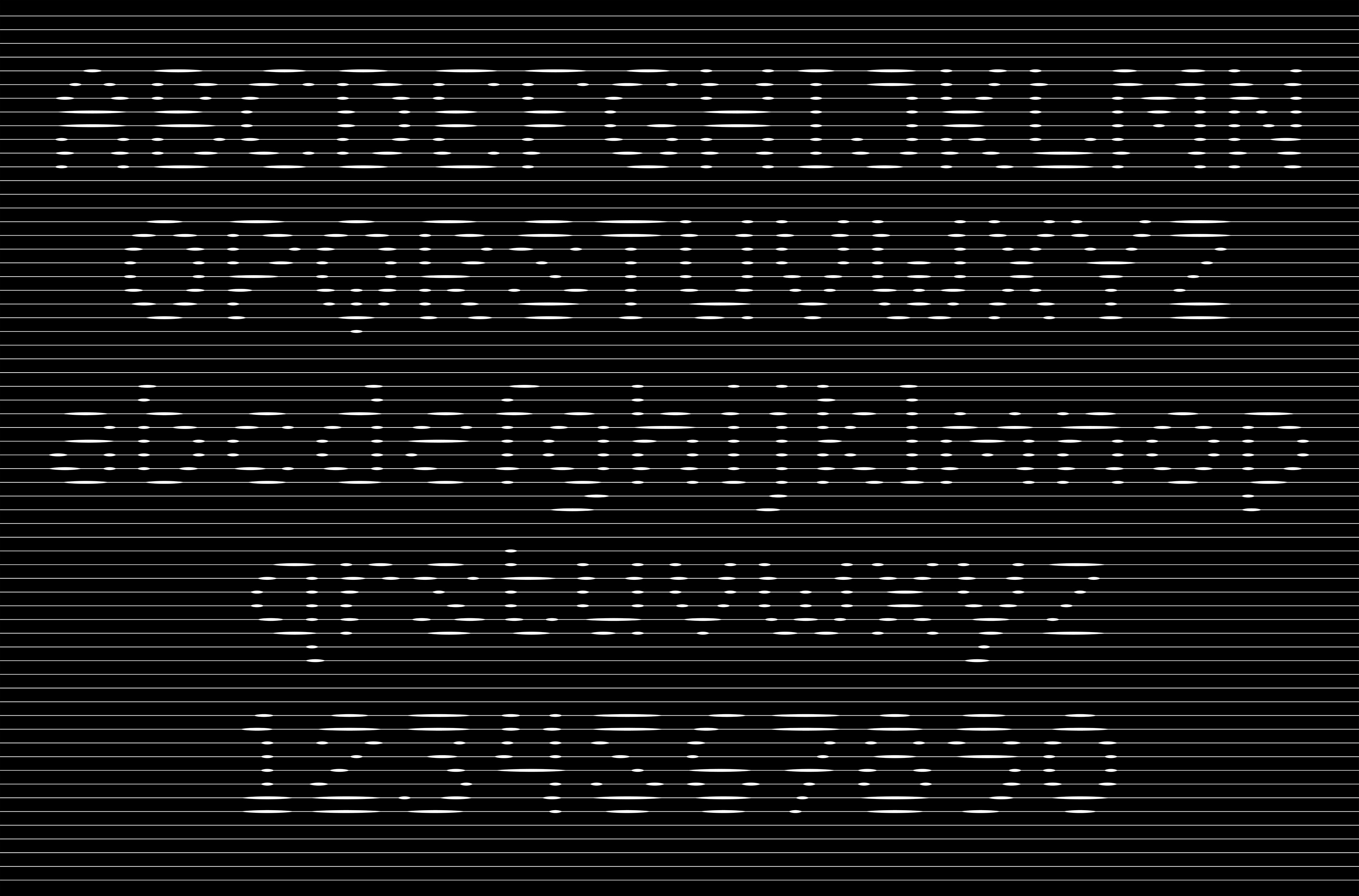
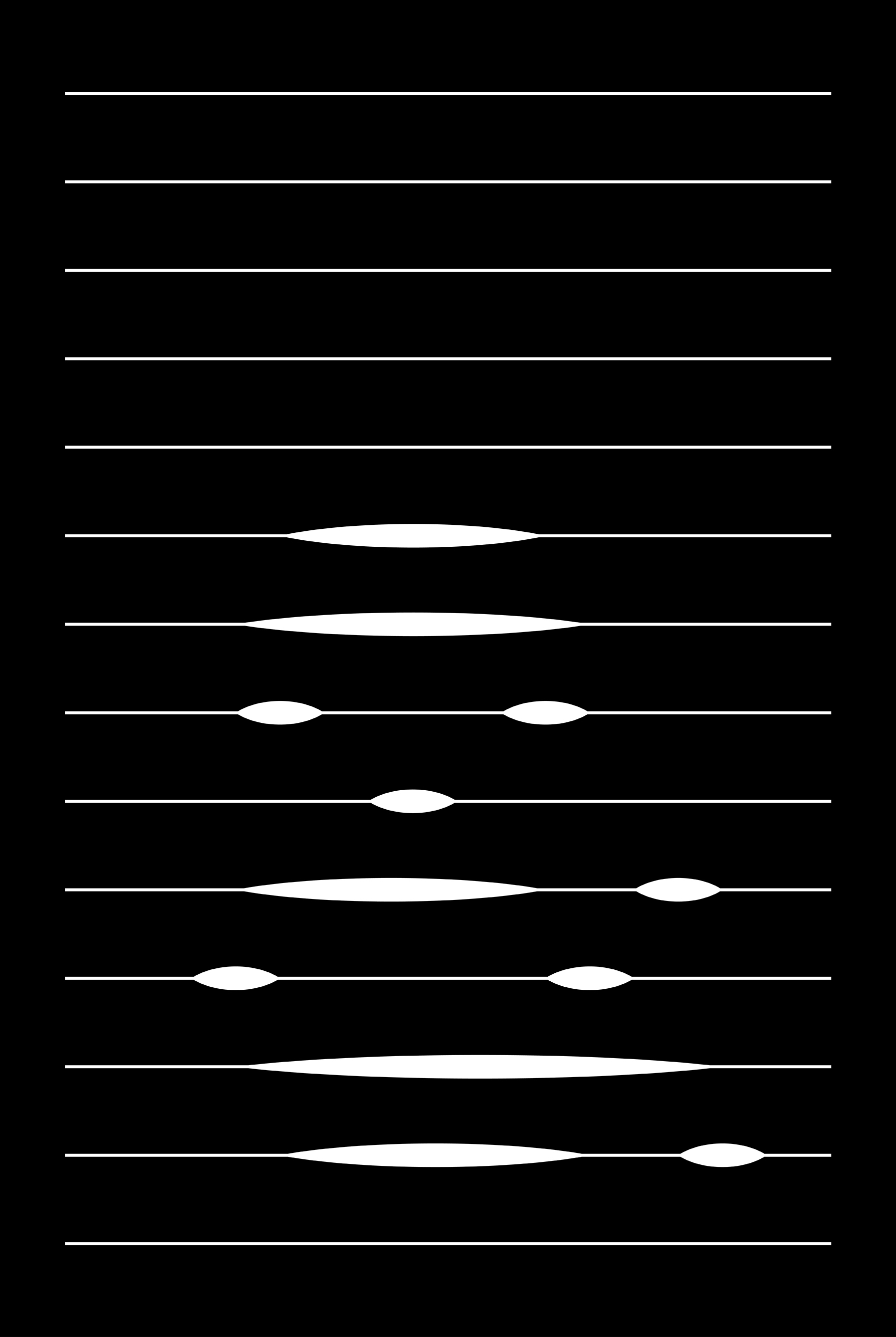
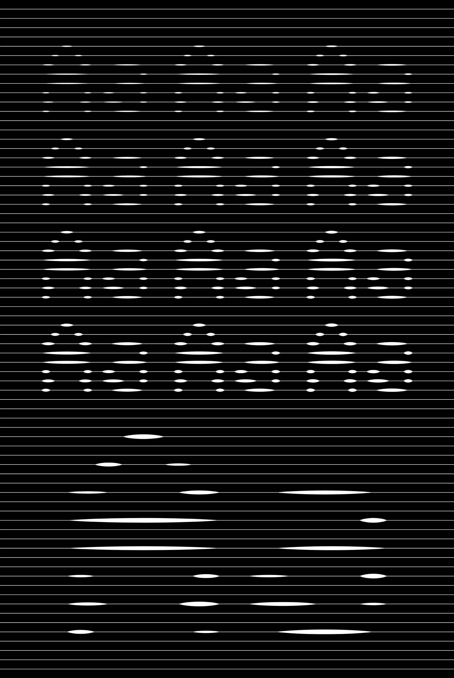
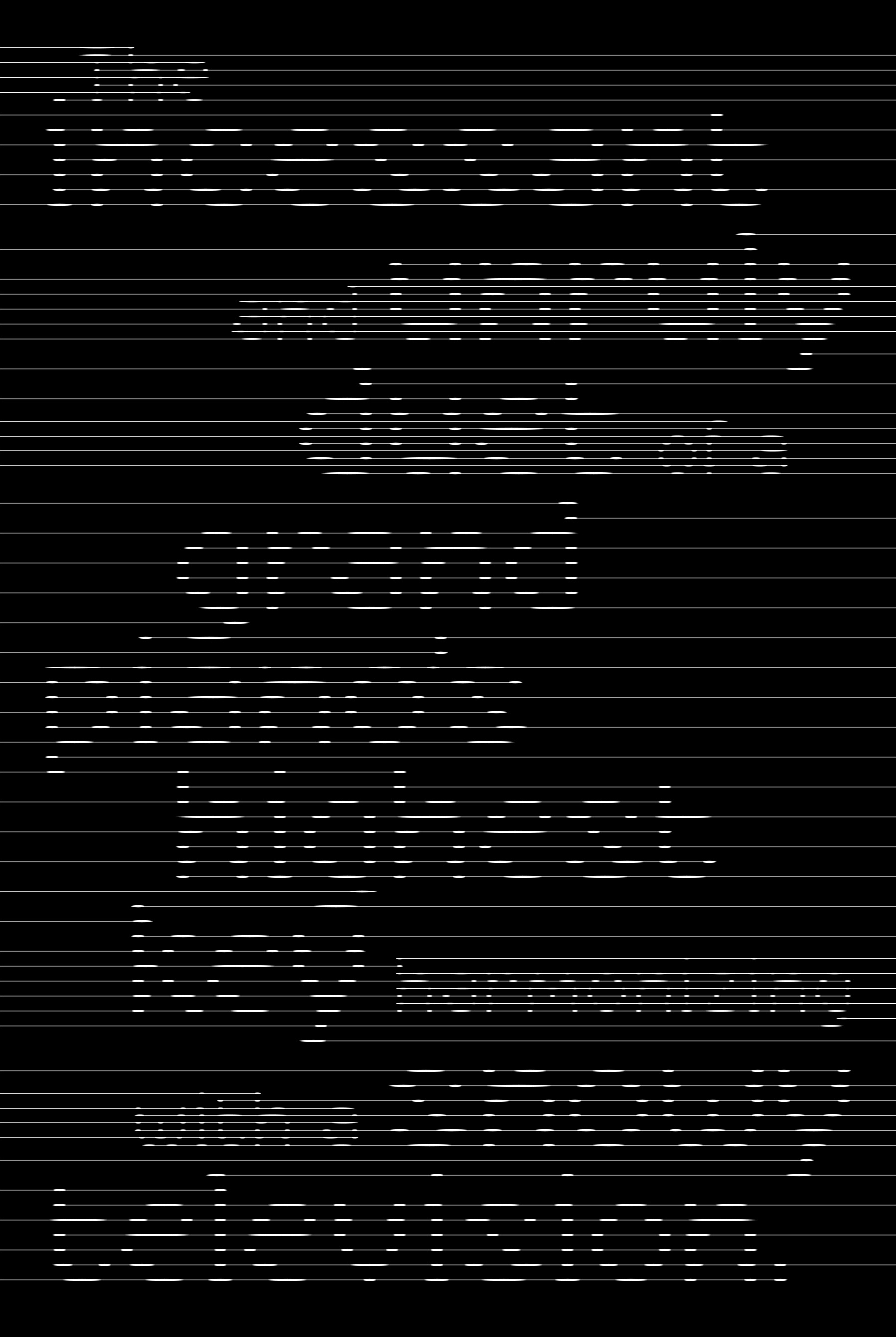
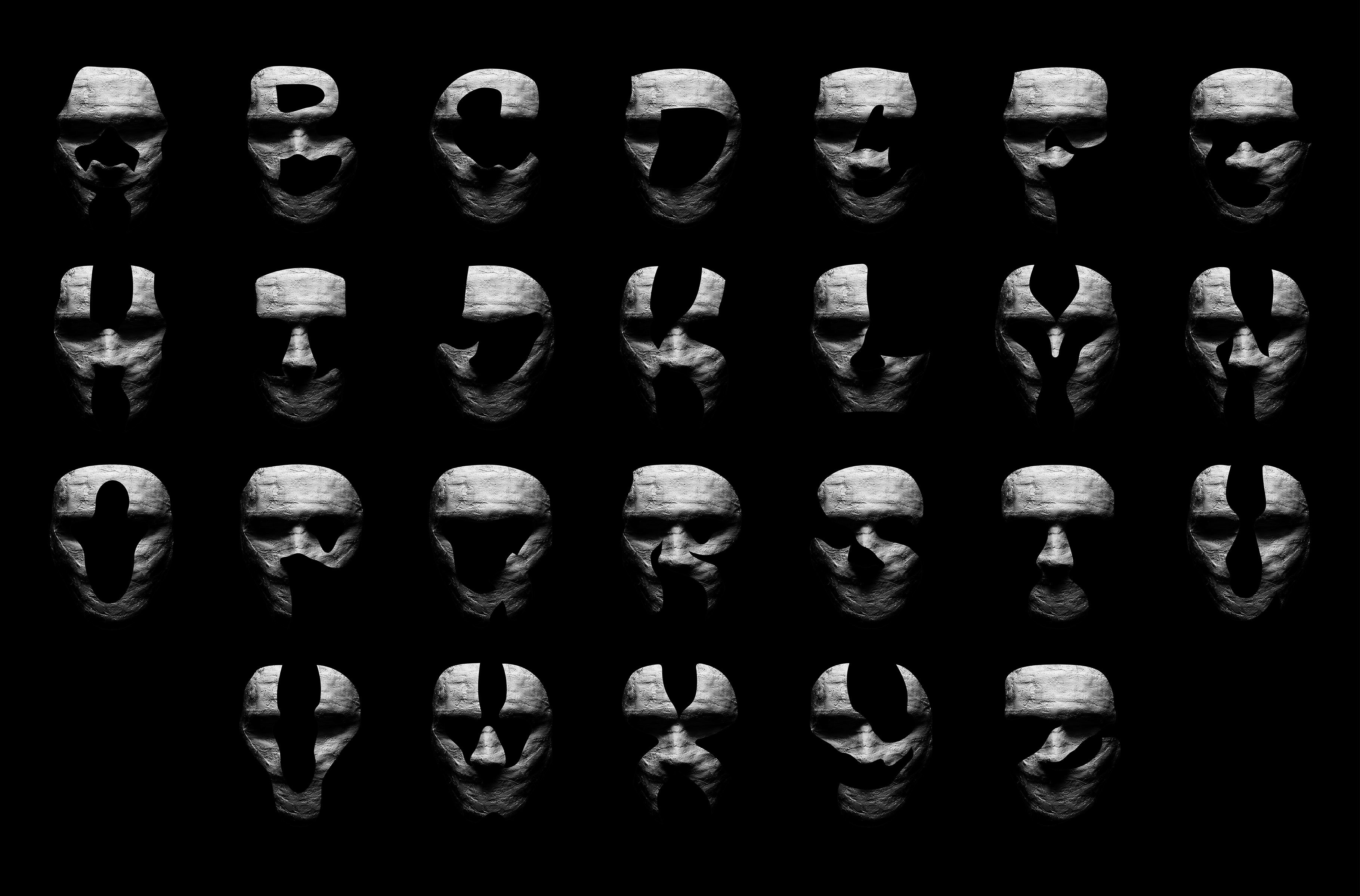
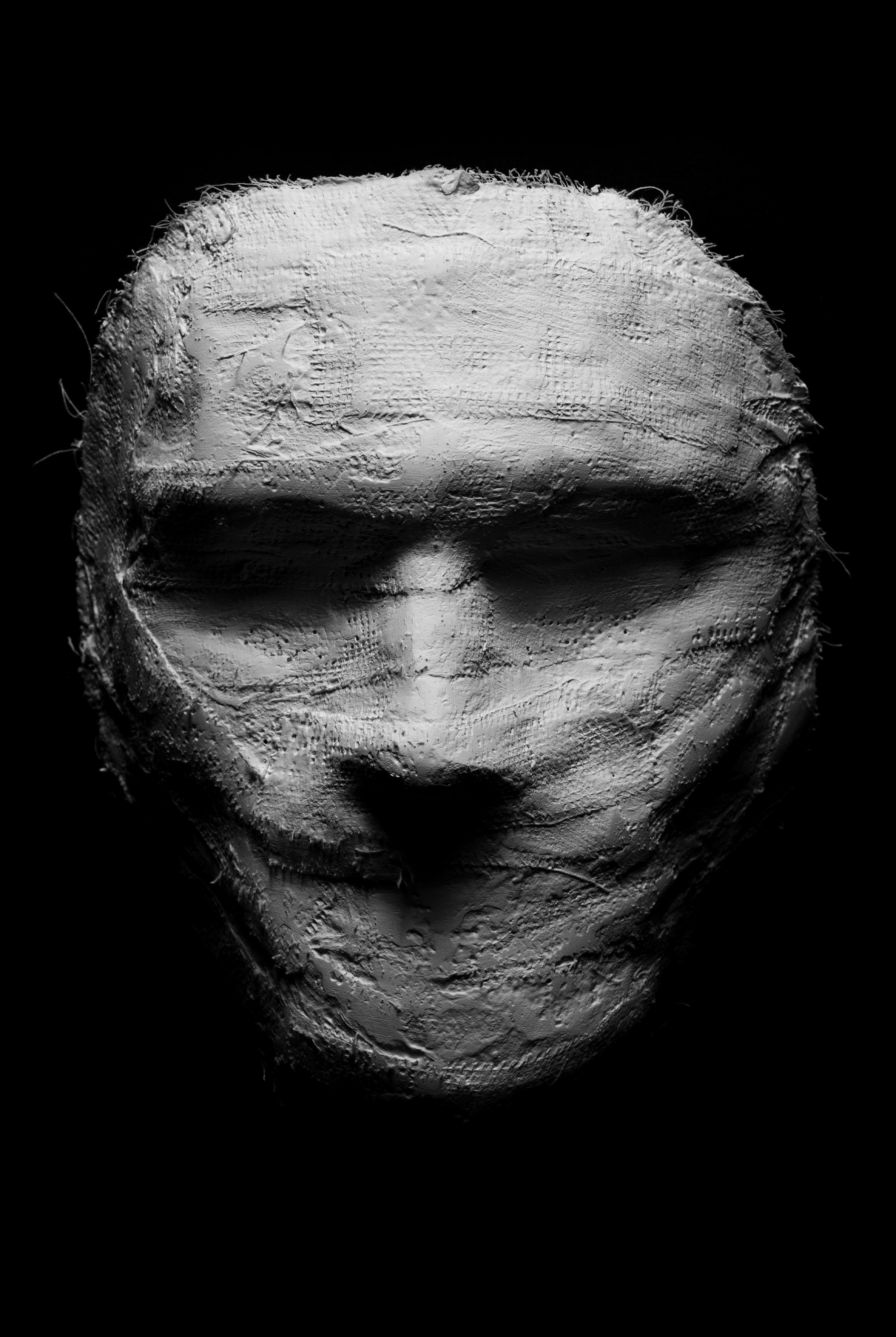
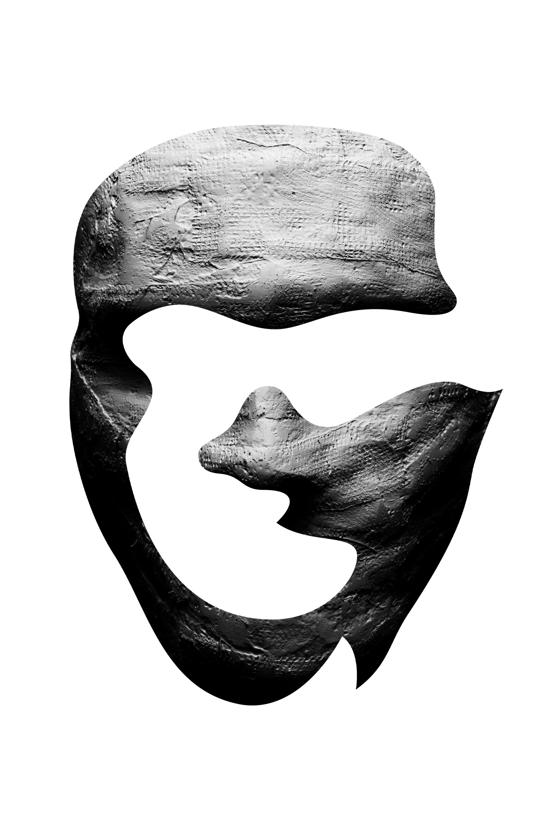
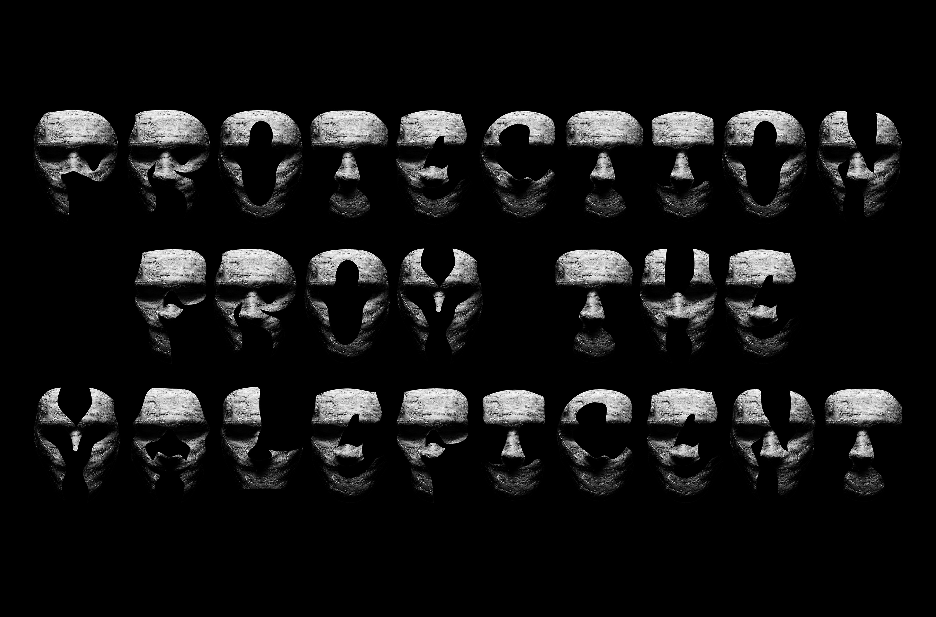
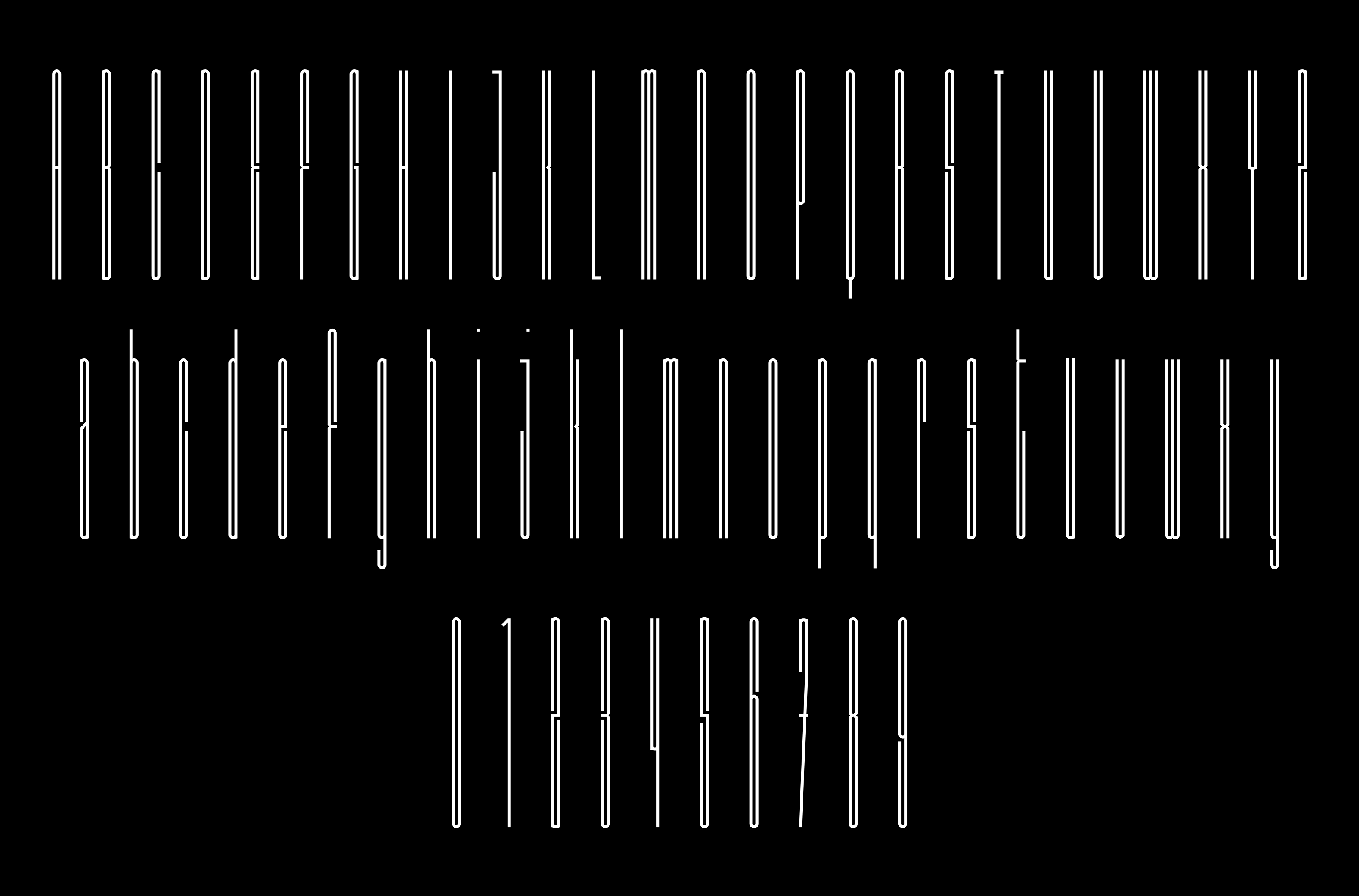
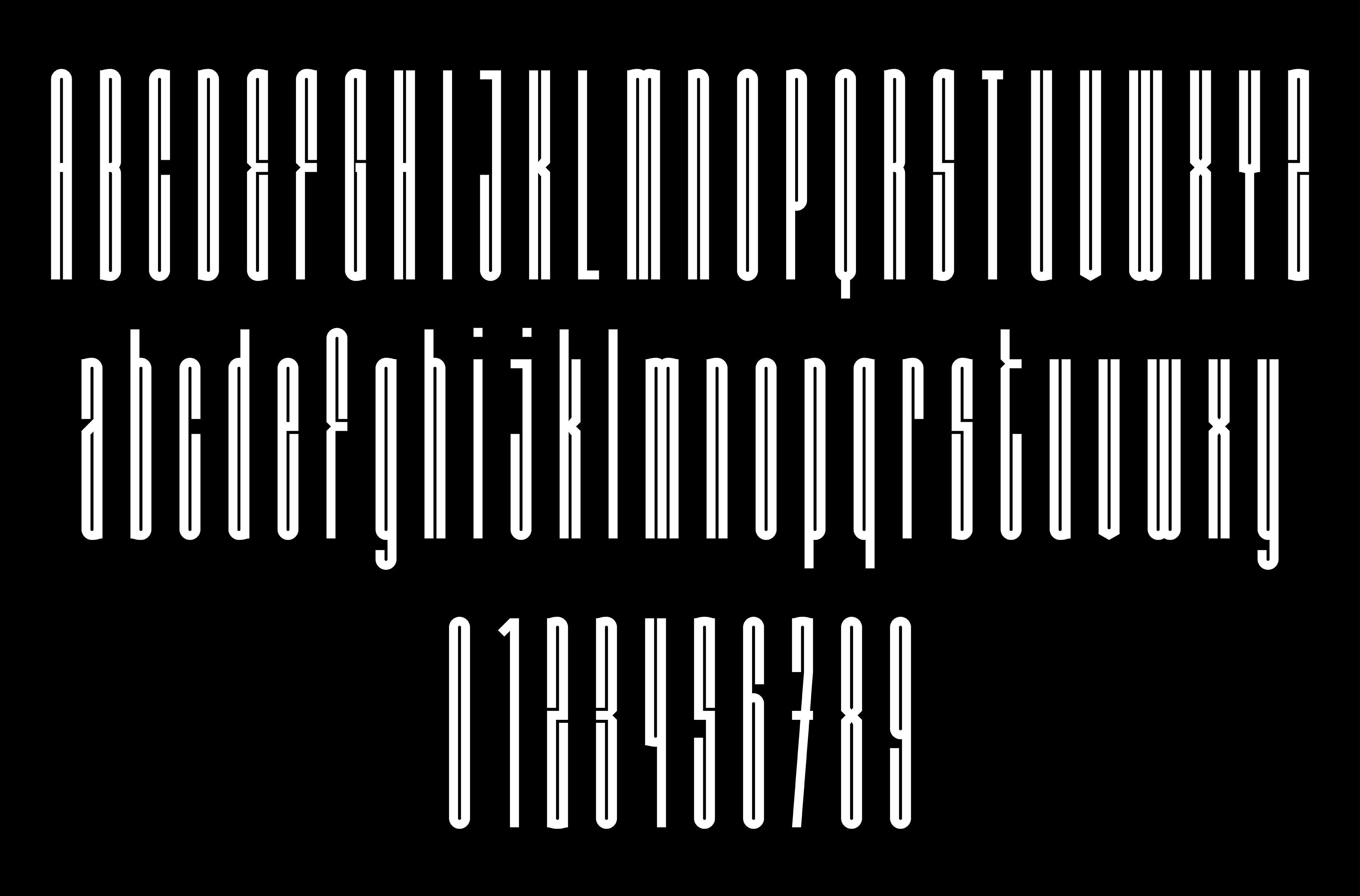
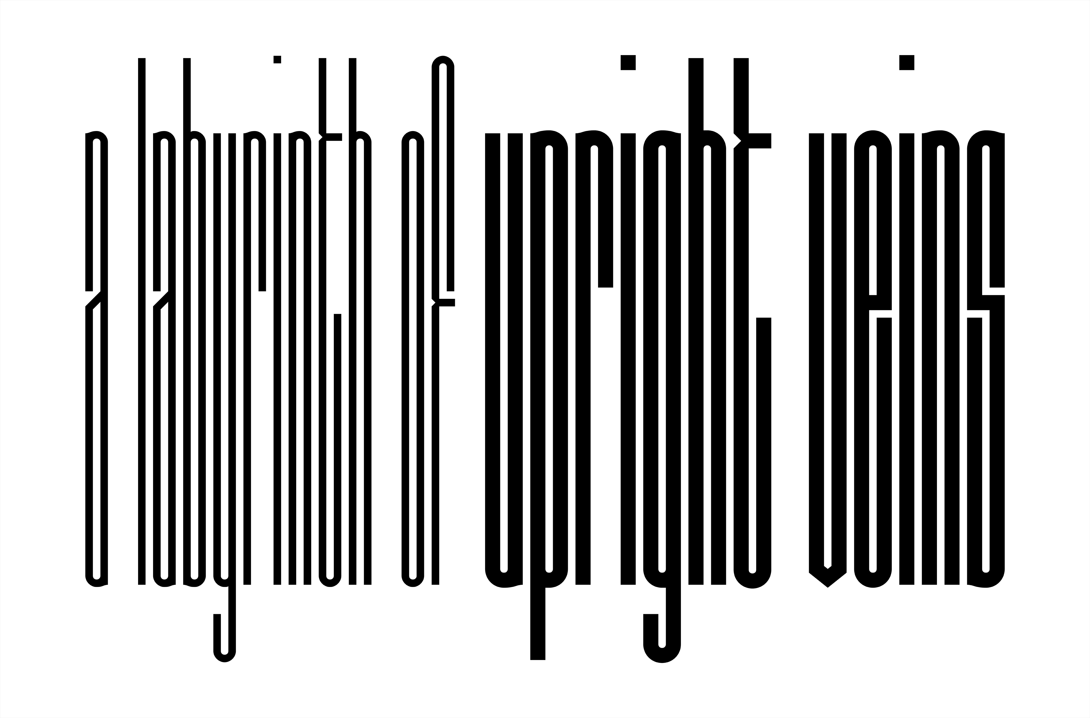
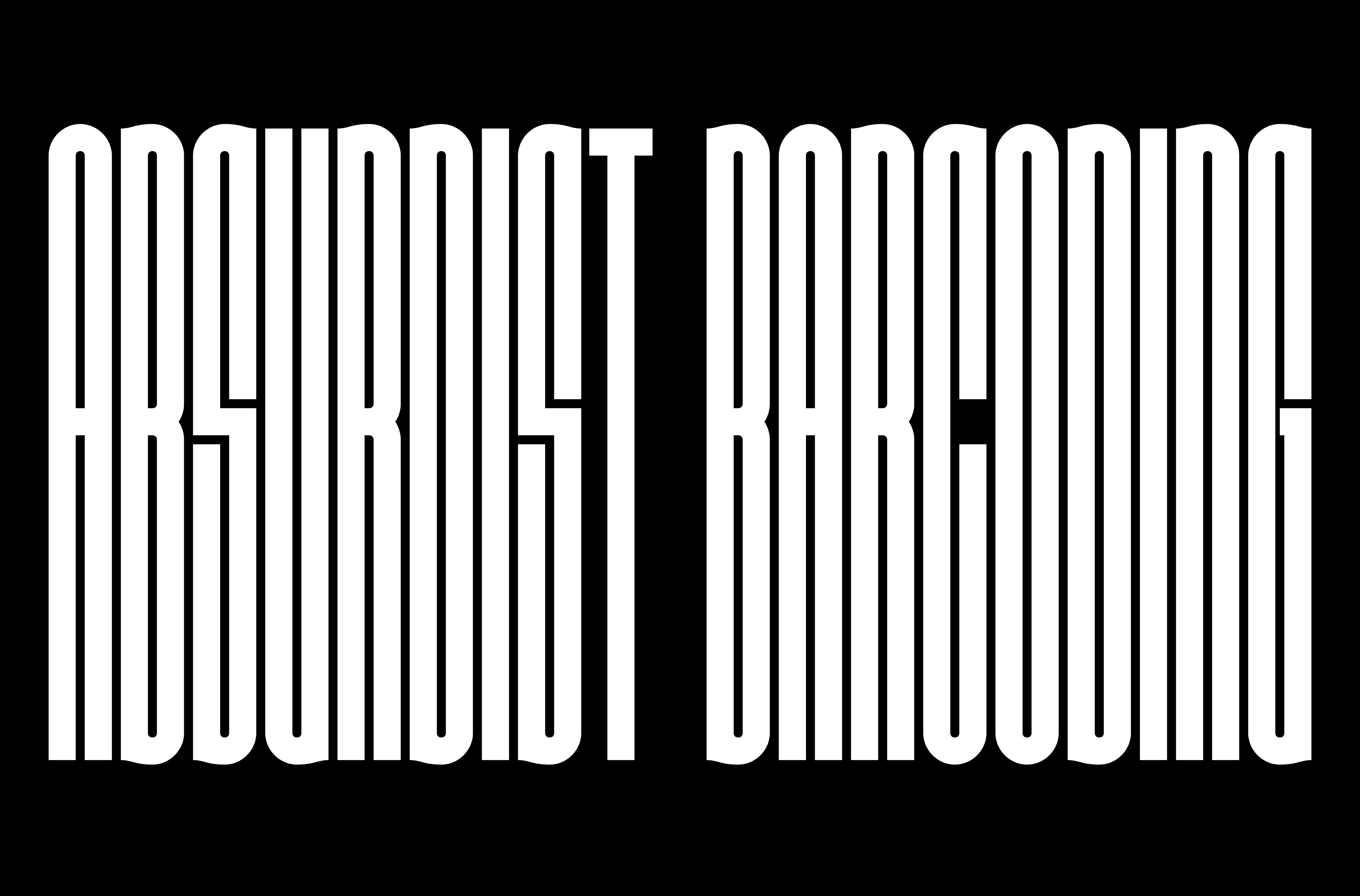
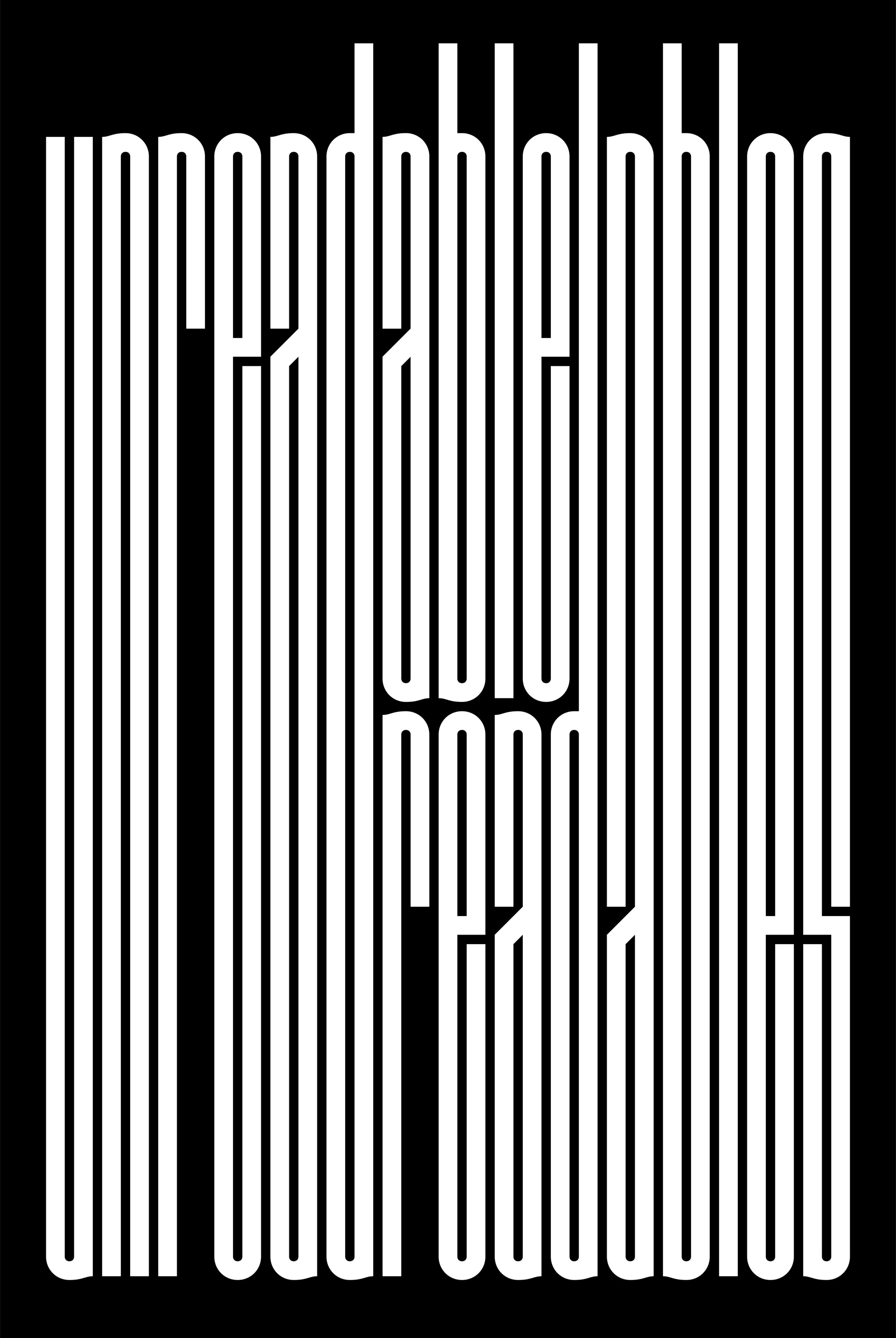
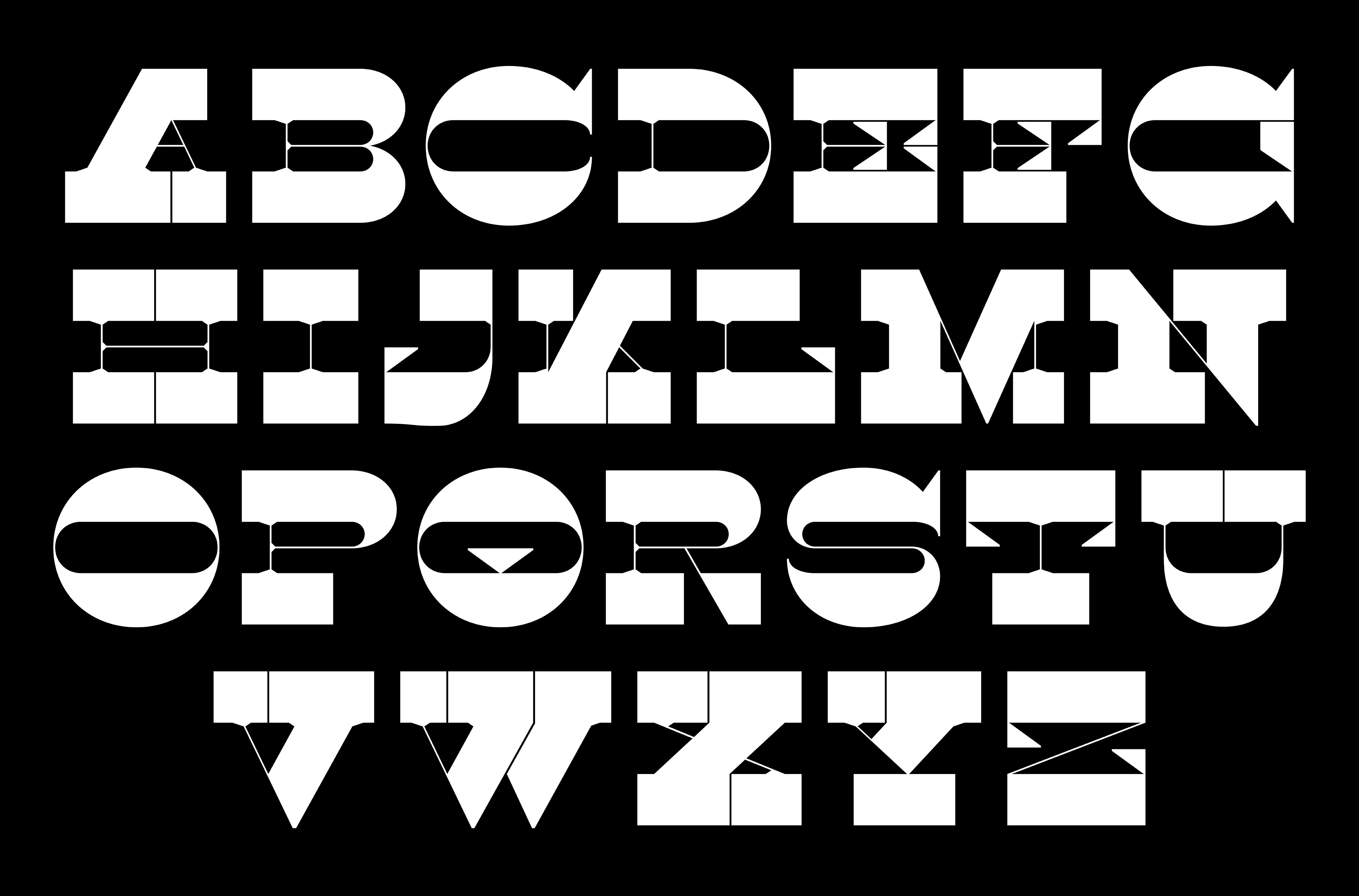
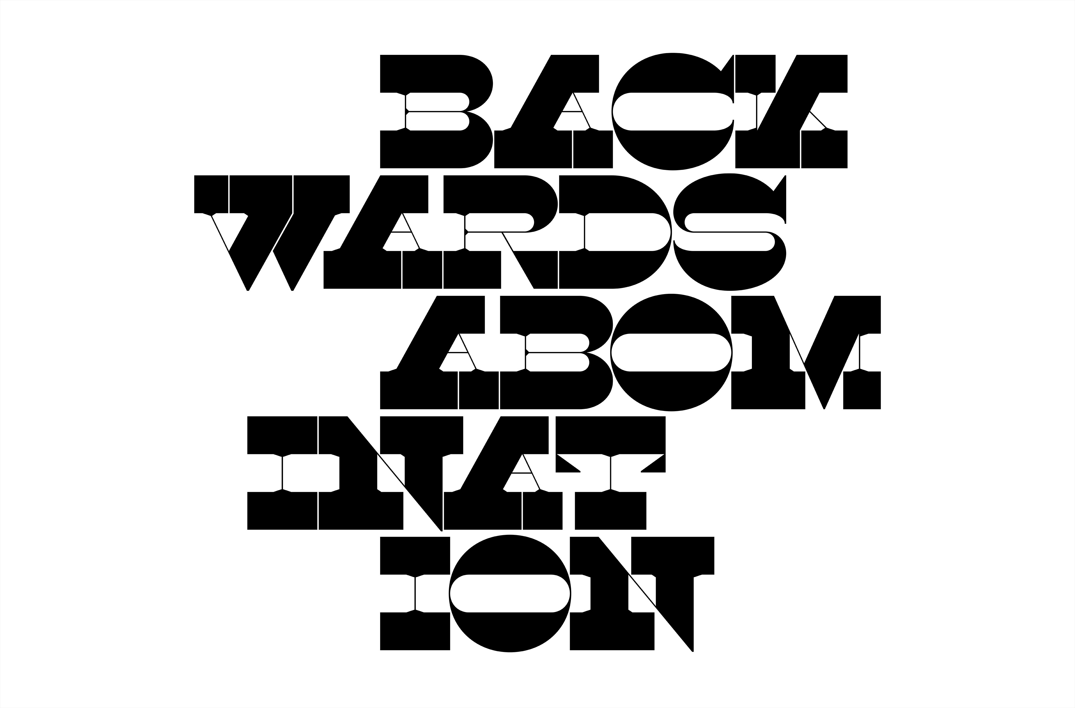
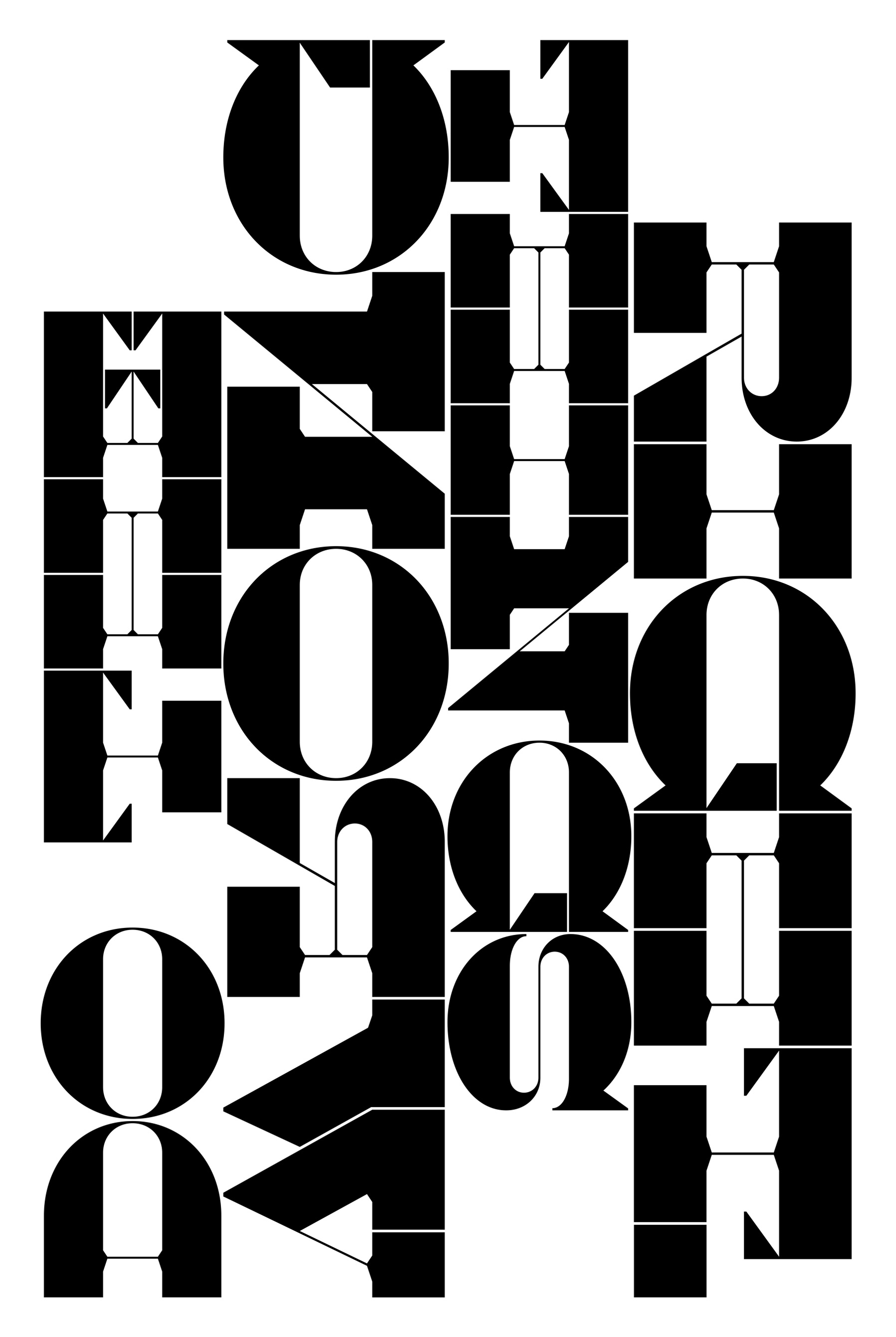
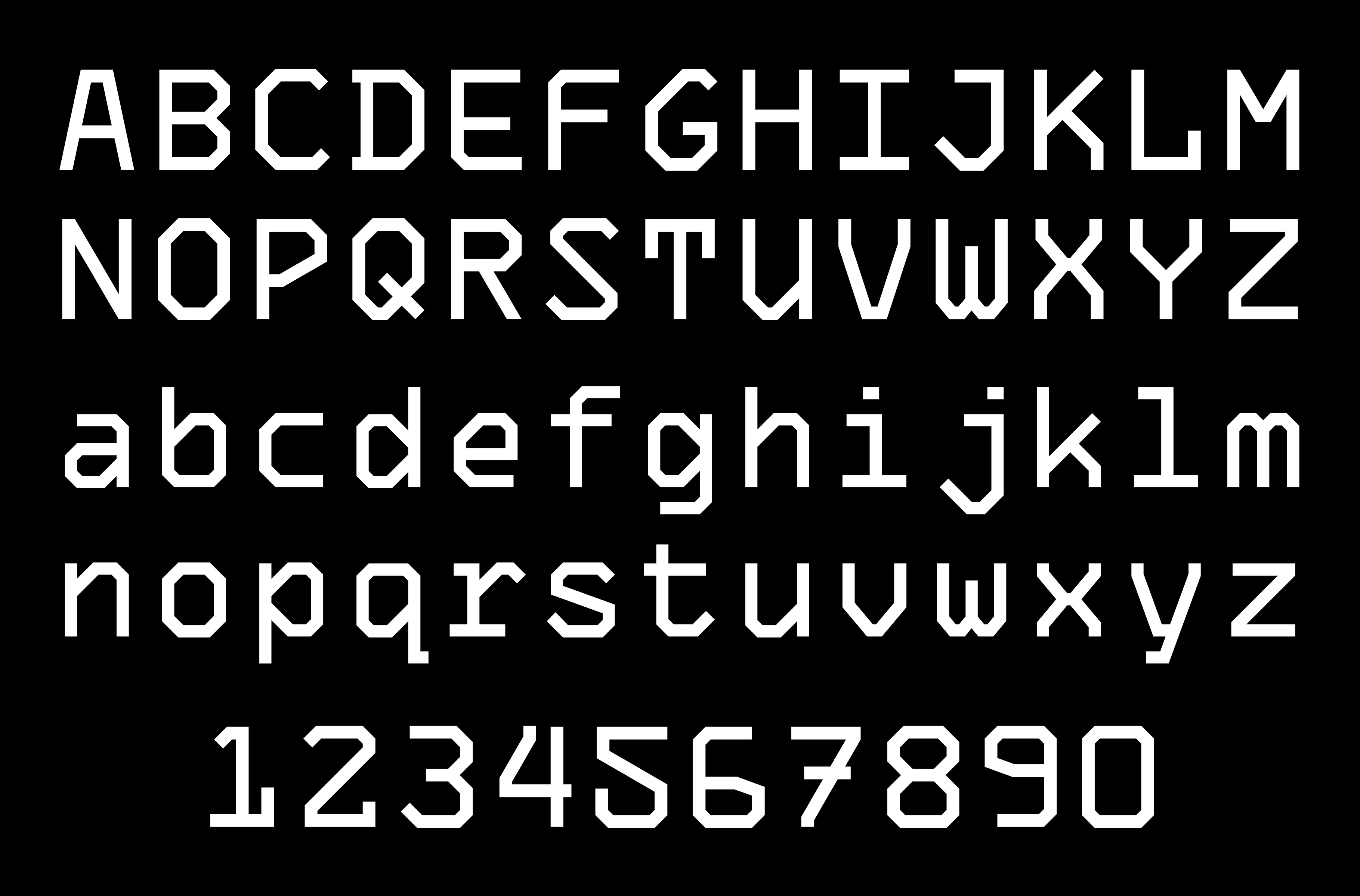
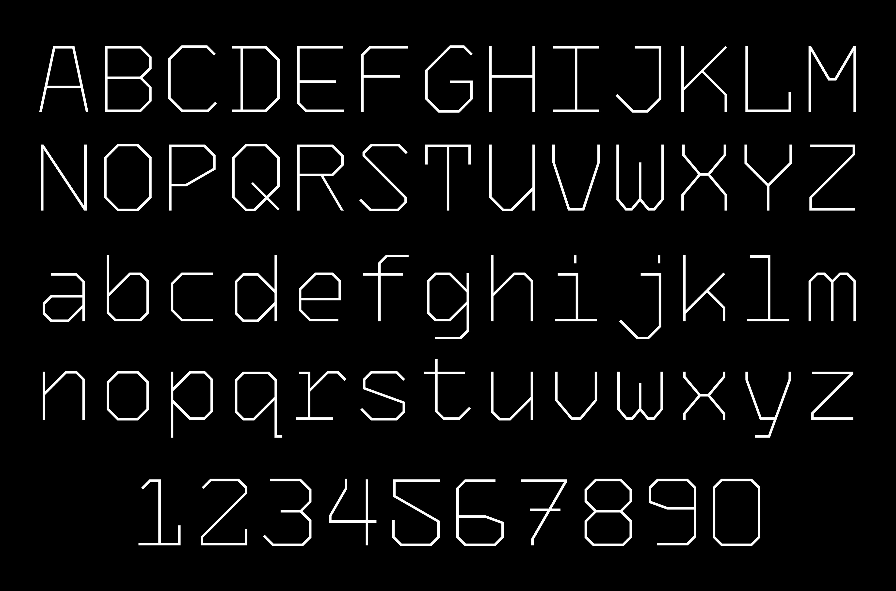
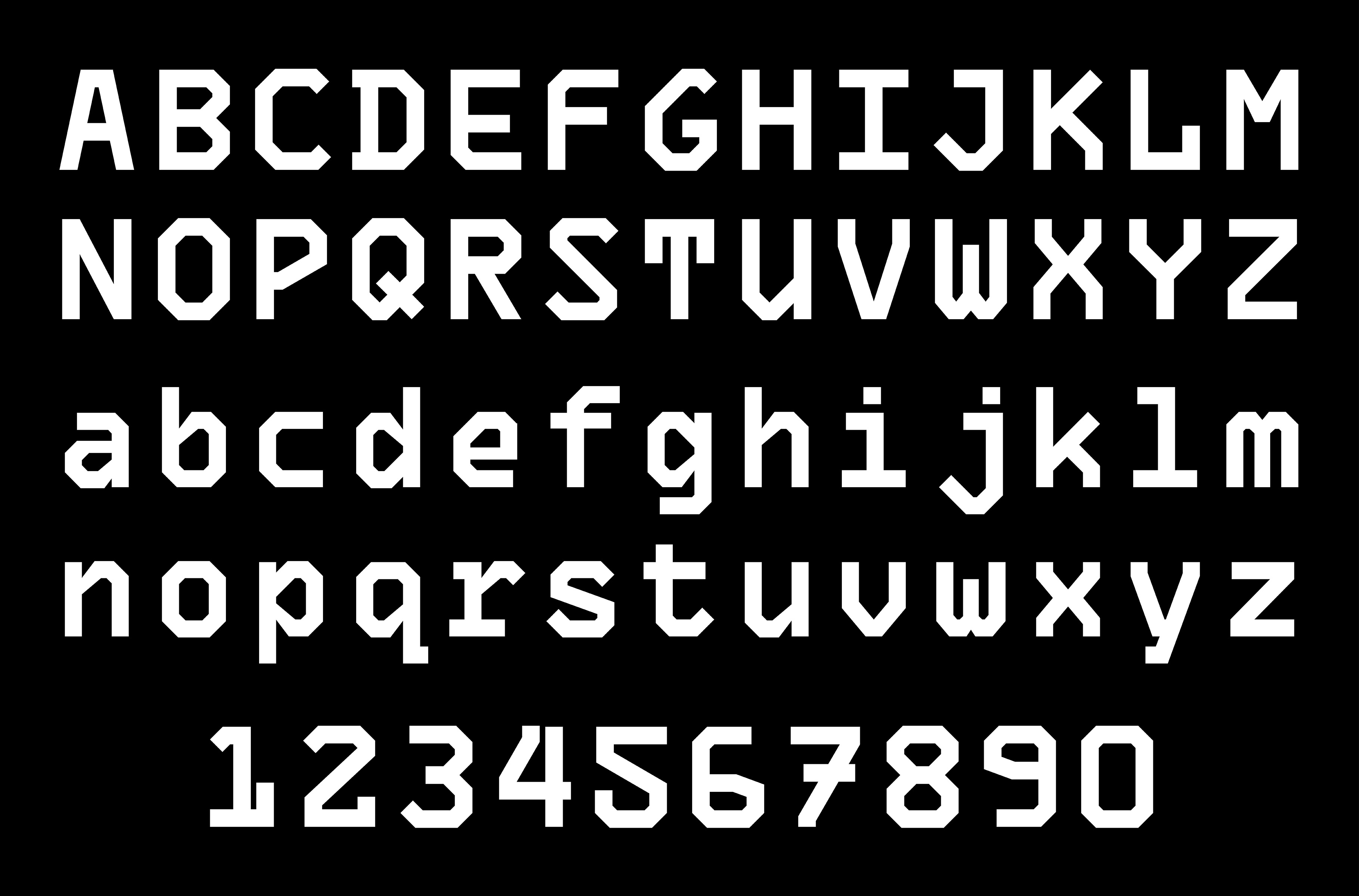
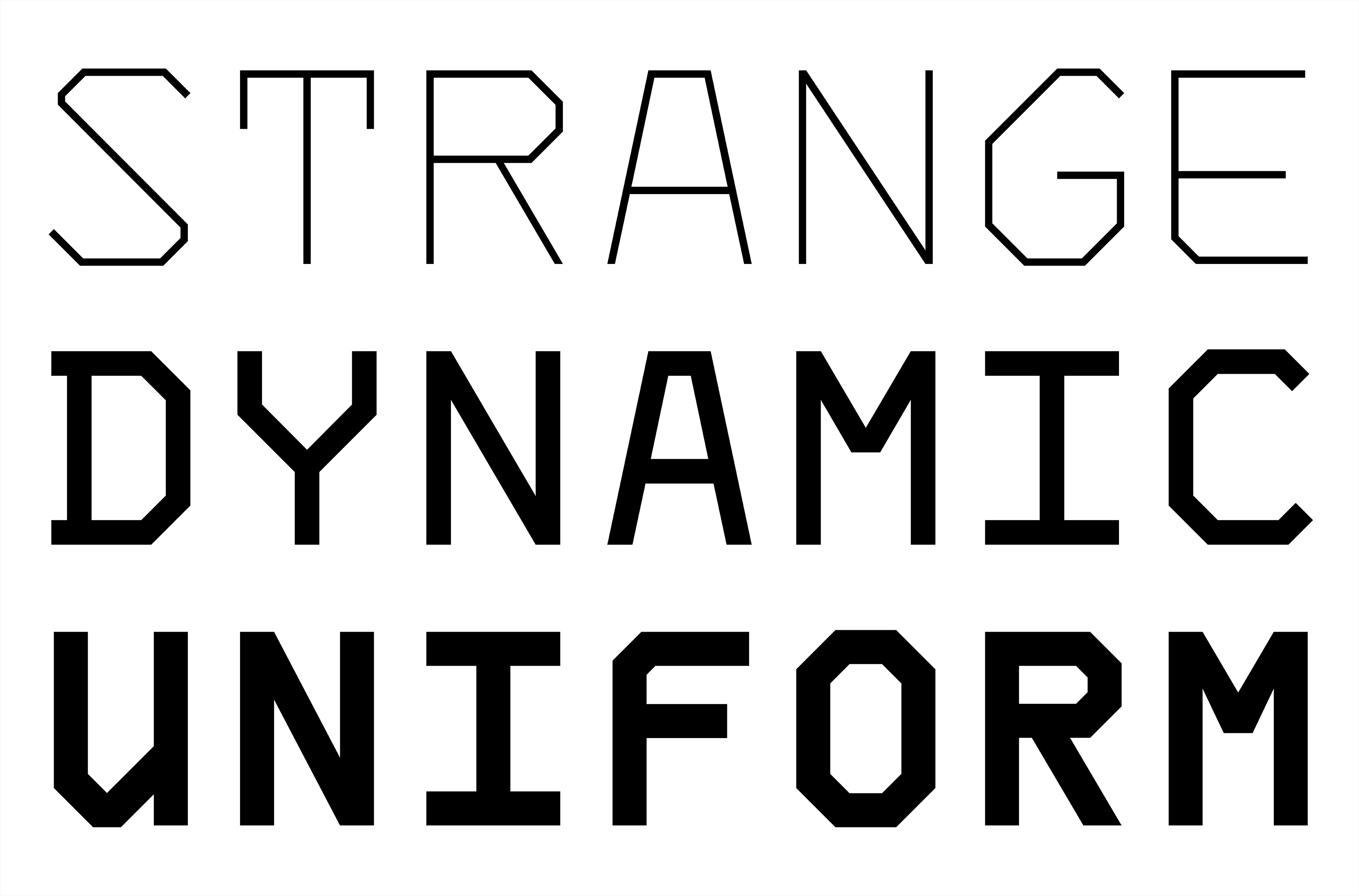
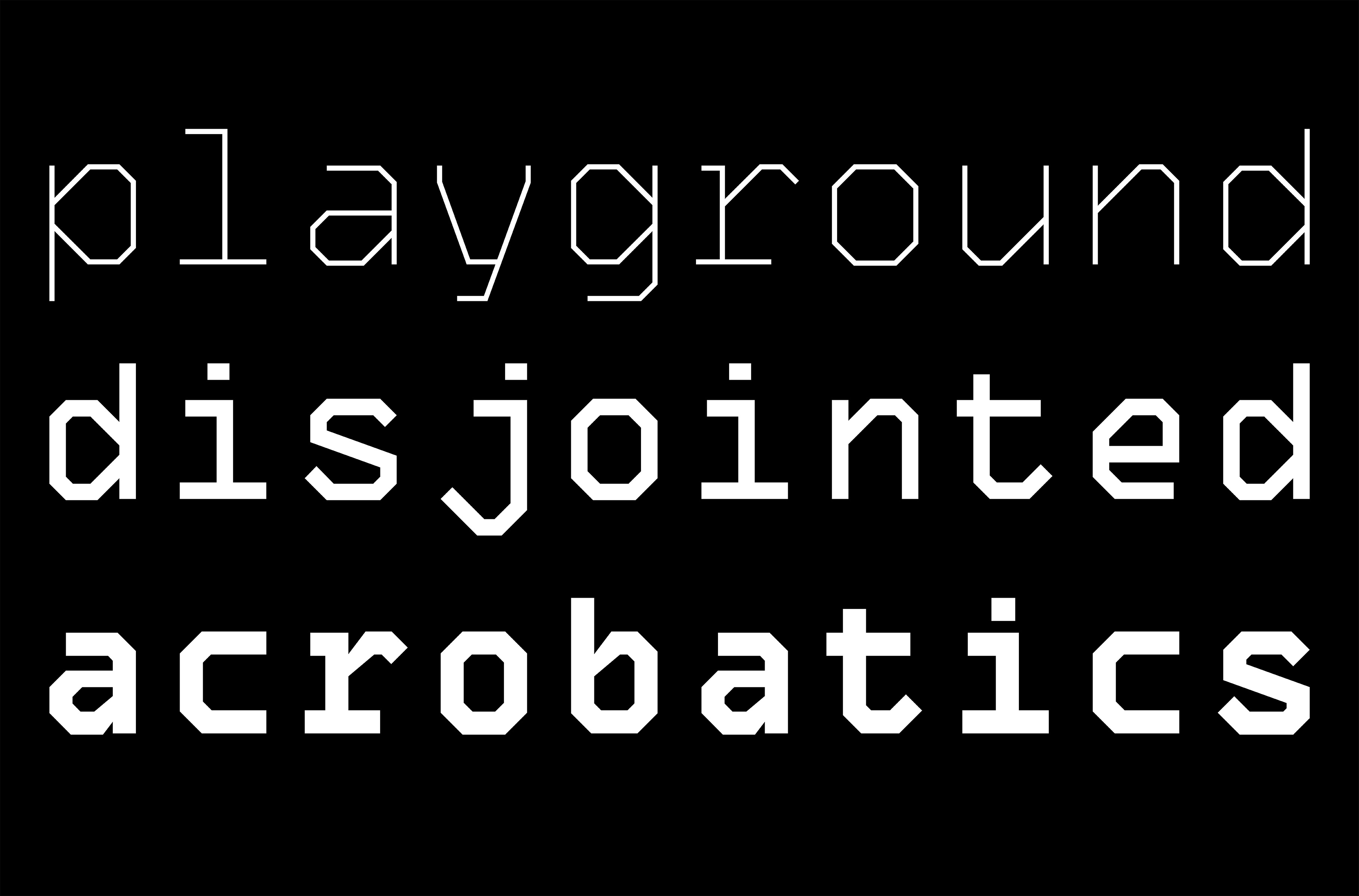
Orca is a small monospaced type family that draws it’s inspiration from OCR-A. It uses straight lines, sharp corners, and odd combinations of type anatomy. I made this to experiment with monospaced typefaces in multiple weights.

I’m drawn to the design of OCR-A because each letter pushes to be unique while at the same time maintaining consistencies to work in a system. I wanted to emulate this idea of individuality in Orca.

Fun fact: the name of my type family “Orca” is an anagram of OCR-A.

spectre

project details —

Spectre’s letterforms are module swells that align to a grid of horizontal lines. Text manifests as vibrational interruptions of consistency, creating rhythmic textures. The swells of the letterforms are fluid. Individual swells within letters can be varied as well as whole letters or words to create a complex vibrational quality.

This typeface is used in my I Can’t Sleep book series.

casted

project details —

Casted was created while exploring visualizations to include in my book Keeping the Ghost at Bay. Each letter is digitally cut from a photograph of a plaster mask I cast of my face. The alphabet became a trope for the auditory masks I use to layer over my tinnitus. The mask can only fit me properly, although still able to be worn by others, just as my masking process is most suitable for my own experiences. The alphabet became a method of communicating textual information about masking using the trope.

oyster

project details —

Oyster is a super condensed display typeface that draws inspiration from a Yale Architecture (Fall 2013) poster. The goal here was to design letterforms as condensed as I could. I then expanded my drawings into light and bold weights.

Now, if only I could read it…

ketamine

project details —

Ketamine is a high contrast reverse stress wedge serif alphabet. It draws inspiration from letterforms found in Caslon Italian and Maelstrom. I don’t have much to say about this one aside from I like the forms I researched. I made my own version to learn how this style is drawn while producing something I can use myself.