project details —
BookBeautii will host two way traffic focusing on helping clients find a solution for their medical aesthetics needs, as well as the promotion of local businesses in the area of cosmetic, and health related treatments. Their pursuit holds core values of sanitation, luxury, and direction.
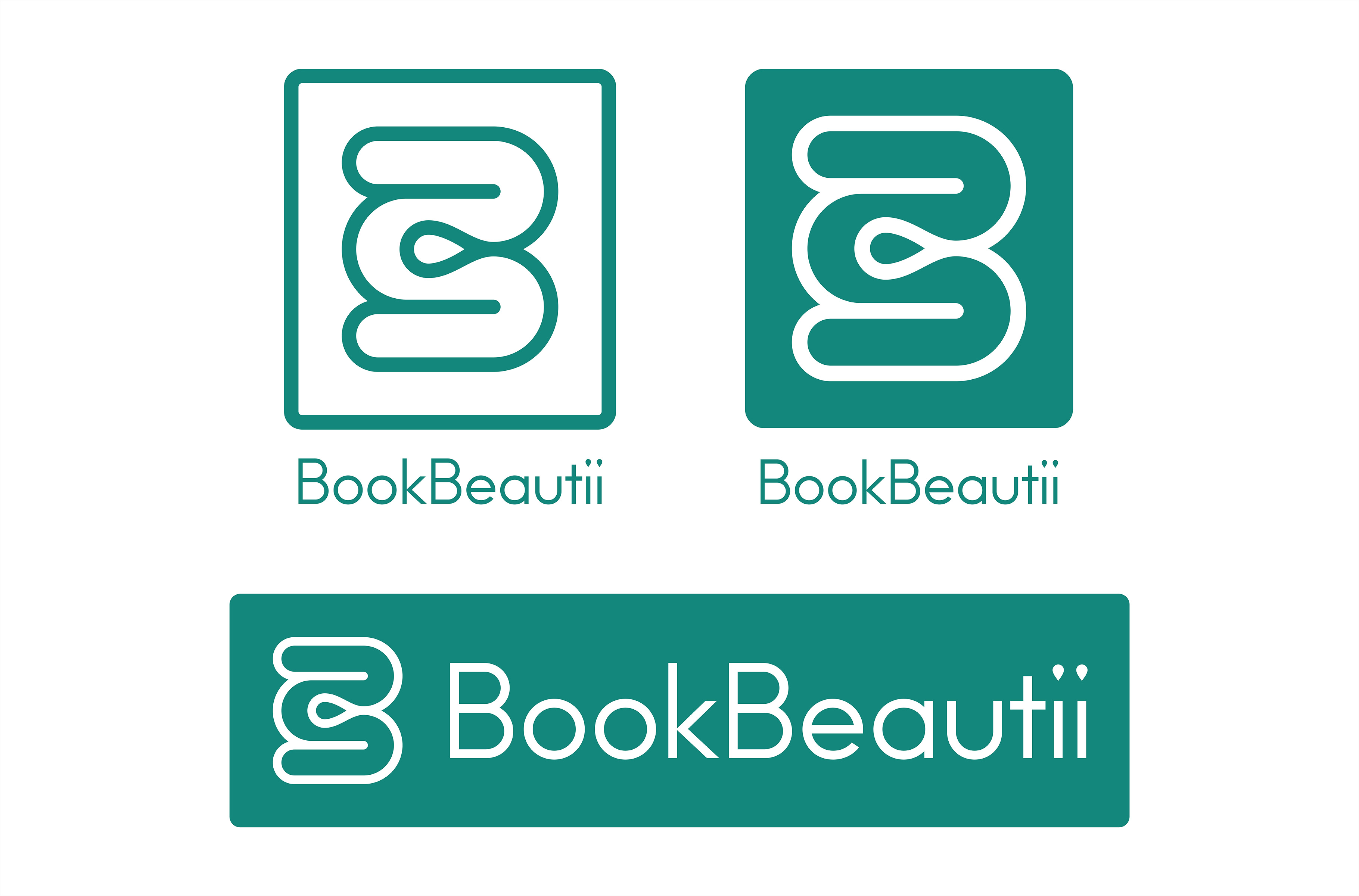
The design of the logo mark creates a capital “B” and the loose form of a “3.” BookBeautii is the centre of three points between client and business with traffic following paths in both directions. A location marker is situated in the centre negative space, marking BookBeautii’s location in the interactions. The “BookBeautii” word mark is custom drawn to harmonize with the geometric monoline of the logo mark.