

project details —
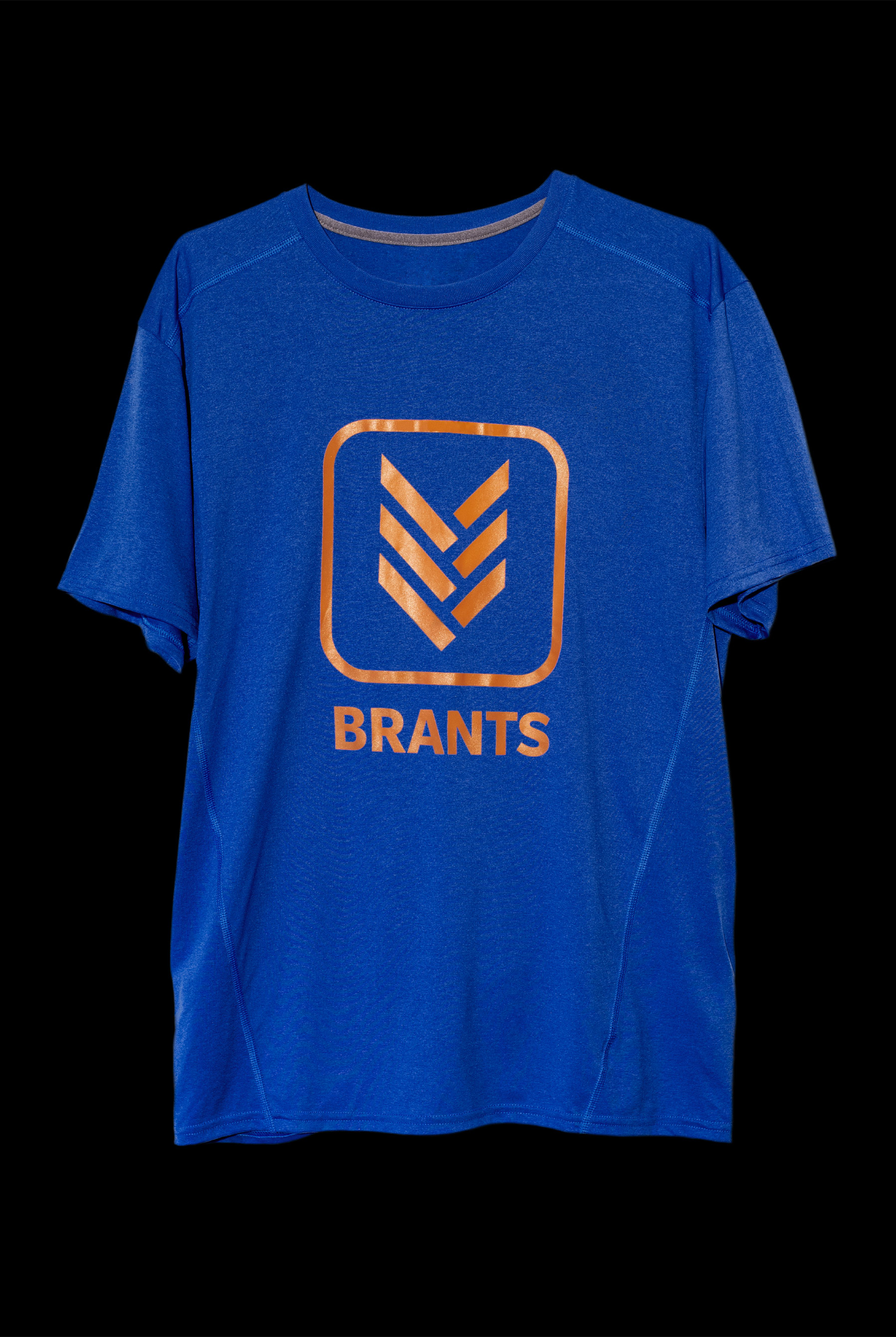
The Burlington Brants coach approached me asking for a new uniform/practice jersey graphic. Colours (blue & orange) and the shirt style had to stay the same (wicking fabric T-shirt).
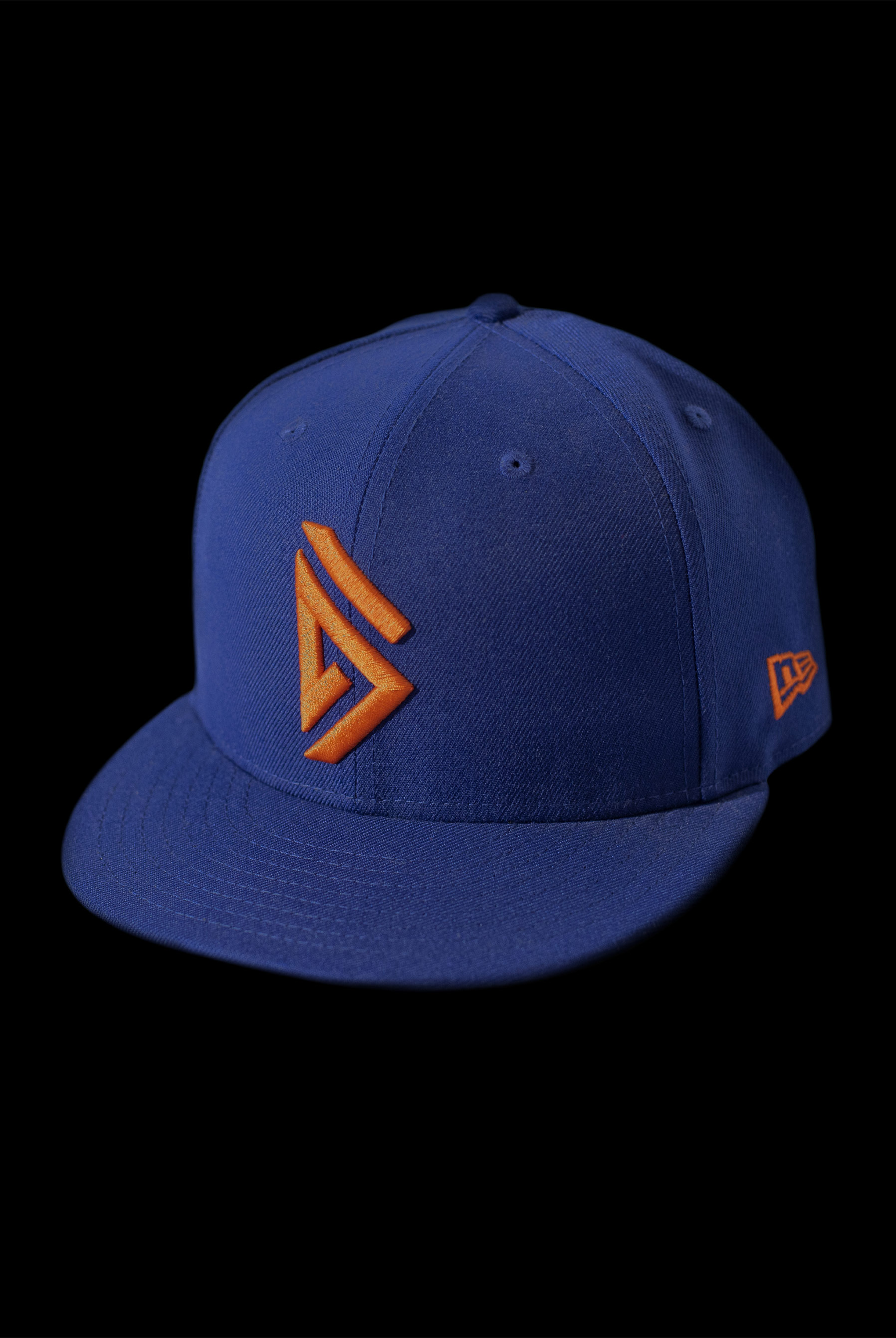
I researched the Mohawk leader, Joseph Brant (whom the team is named after), which brought me to learning about a traditional hairstyle of the Mohawk people. The style involved plucking all hair from the head leaving a square patch of long hair at the back. This hair would then be tied into three braids. The design references this traditional hairstyle, depicting a three tiered braid pattern inside of a rounded square. The graphic is informed by an identifying characteristic of Brant’s culture as an homage, and translated into something new to avoid appropriation. Additionally, a “B” was designed to harmonize with the three tiered braid. This was embroidered into team baseball hats.